DAY&NIGHT
Packaging Design - Ritual & Repair (2022)
Ritual, by definition, refers to conducting the same actions, in the same way, every time (Cambridge Dictionary, n.d.-a), while repair means reversing the broken status of something and returning it to its functional or better state (Cambridge Dictionary, n.d.-b). Sleeping is an everyday action that assists one to recover their strength after a long day, which is the typical problem faced by young adults – insomnia (Bernstein, 2021) will be focused as the main concept throughout this project. Hence, the objects chosen for this project are coffee beans and sleeping pills branded respectively as ‘DAY’ and ‘NIGHT’, contrastingly serving as the cause and cure of insomnia.
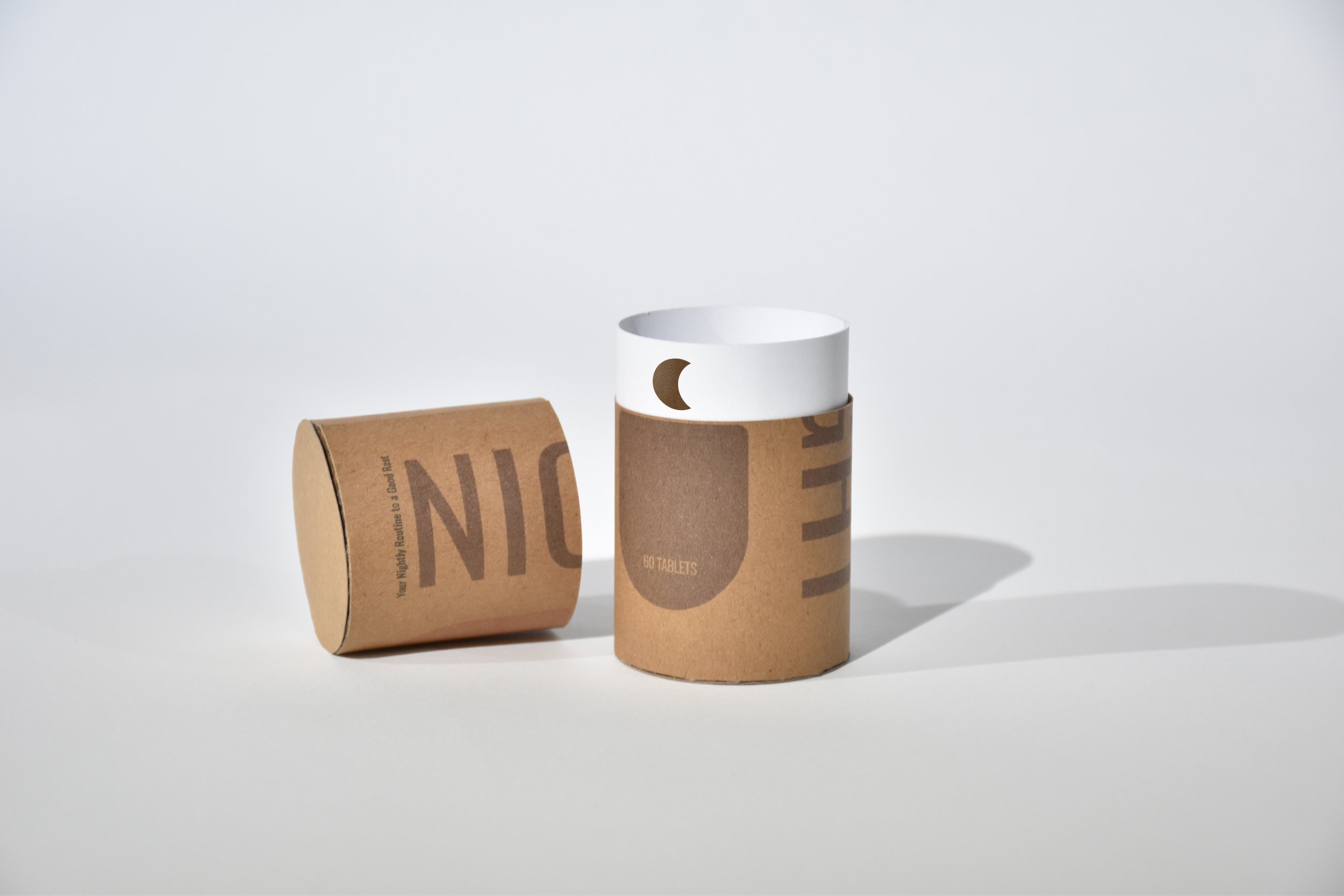
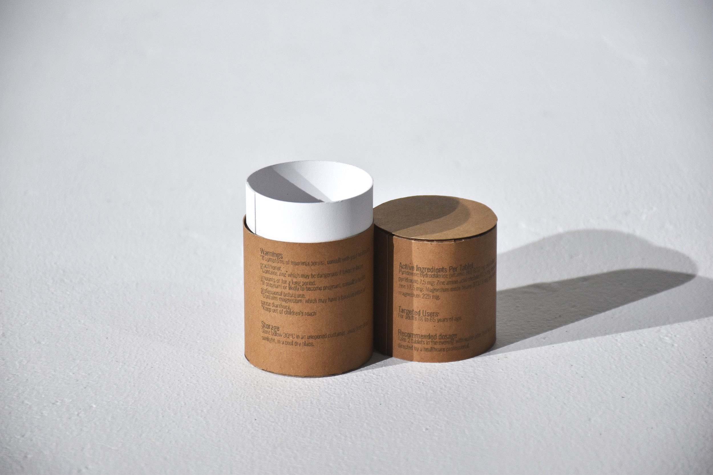
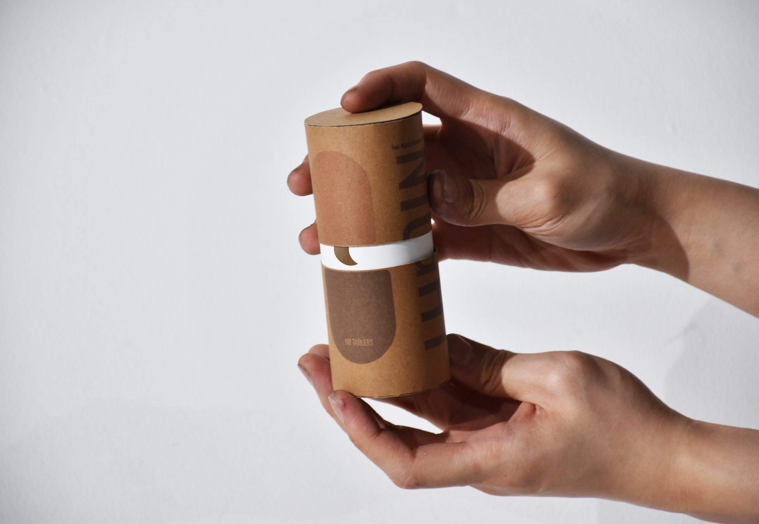
Despite coffee being part of Australia’s cultural significance, caffeine is considered a stimulant drug that speeds up body and brain function. The ritual to repair one’s sanity and energy every morning is more likely to become an unconscious addiction that causes insomnia (Hilliard & Parisi, 2021). Caffeine is then to be visualised in the form of a coffee bean, as the main source of caffeine consumption in Australia comes from coffee (Alexis, 2021). Conversely, the packaging done for the coffee beans mimics the form and functionality of typical medicine packaging, implying that caffeine addiction is no different from drug addiction. Inside said packaging, each bean like a pill is neatly contained inside a plastic sheet of capsules, further imitating the packaging of medicines and conceptually limiting the consumer’s use of caffeine. On the other hand, though sleeping pills can be considered the ritual that repairs insomnia by assisting one is falling into a peaceful slumber, consuming sleeping pills risks one’s independent ability to fall asleep naturally, gradually making them less effective and worsening insomnia when attempted to quit (Bruce, 2021). The typical packaging for sleeping pills and cylindrical packaging for coffee beans are reversed, implying both objects’ similar addictive traits yet contrast with their functions and negative effects.
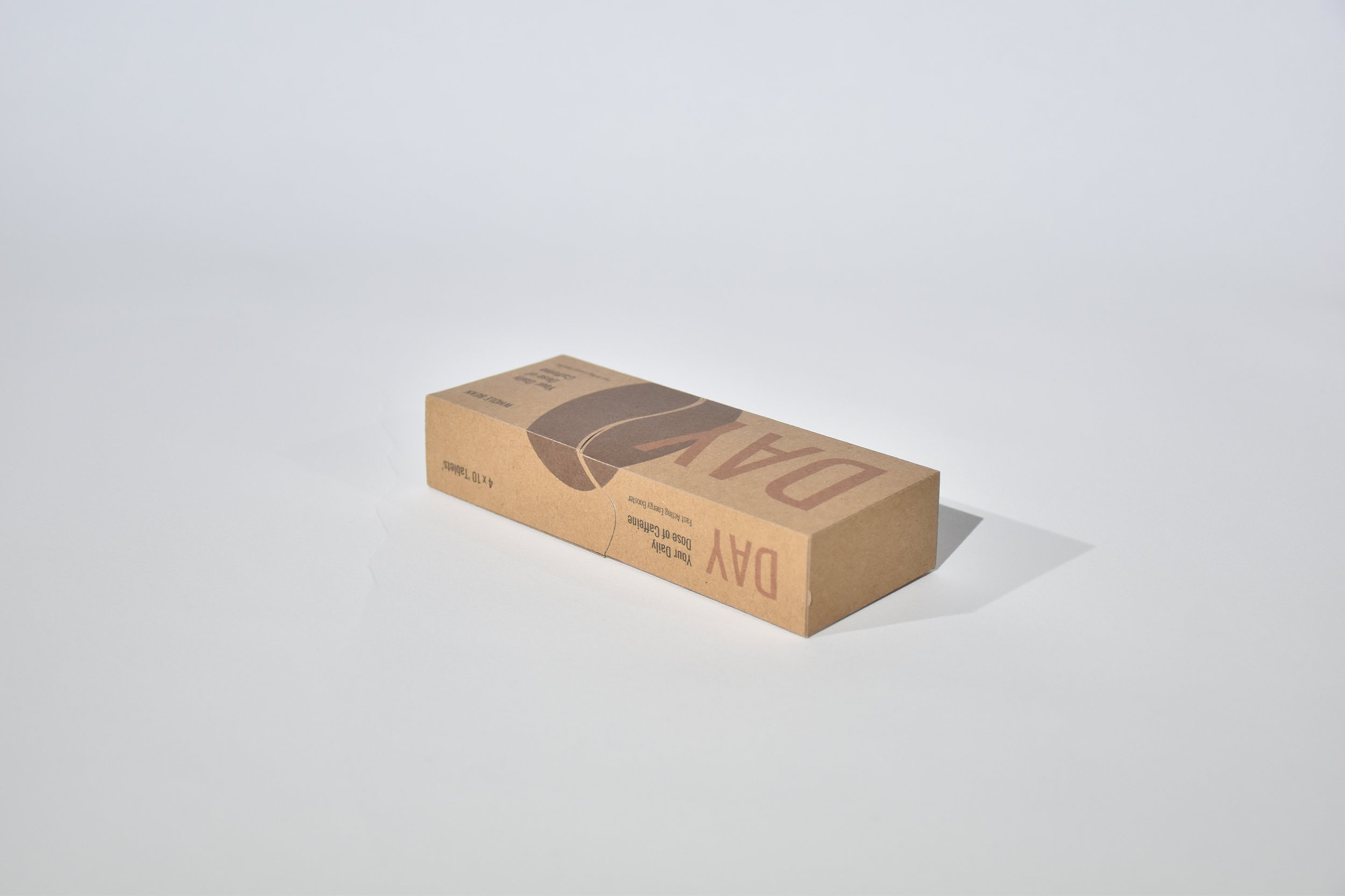
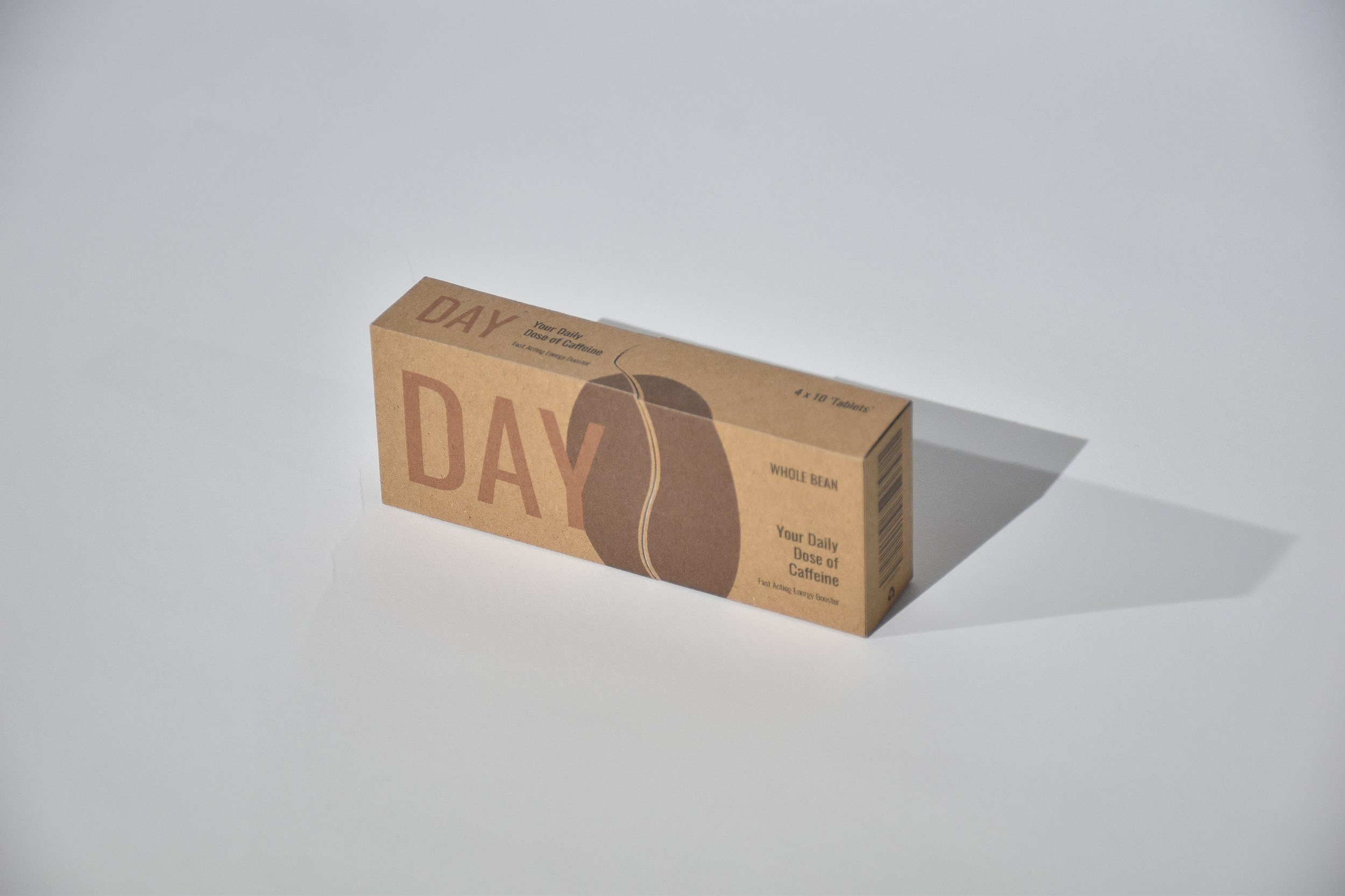
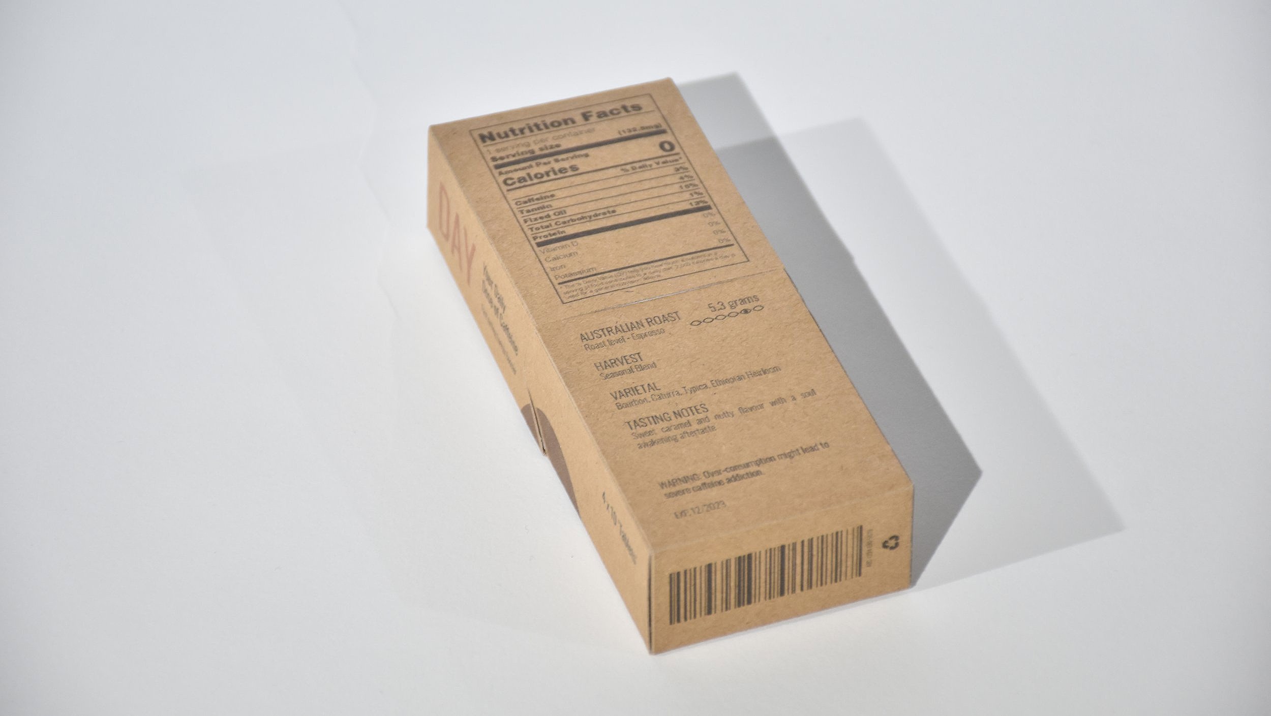
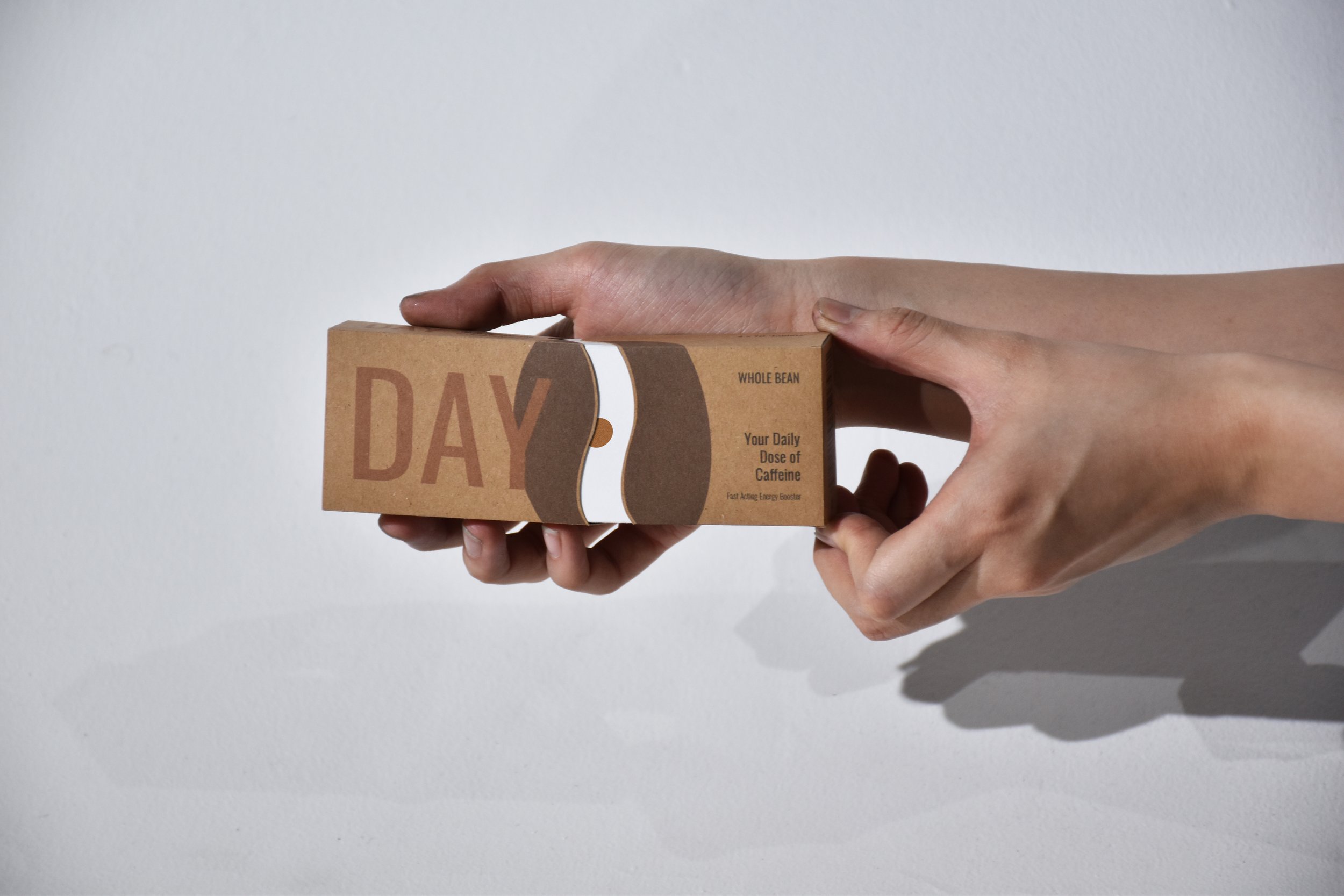
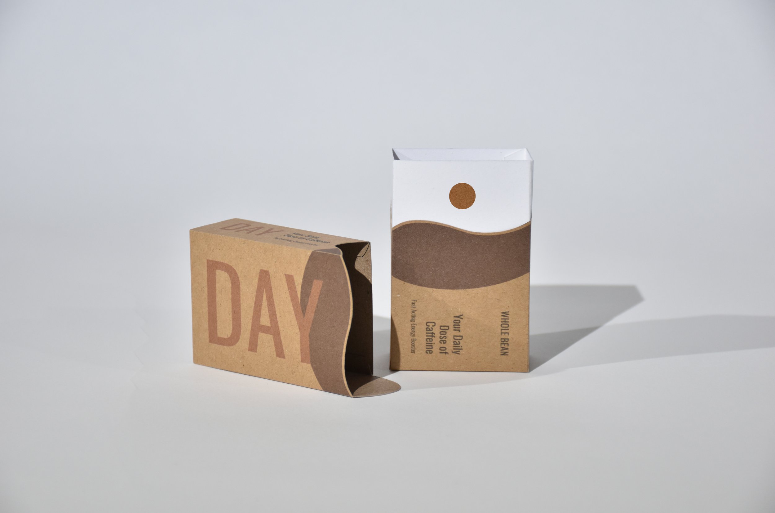
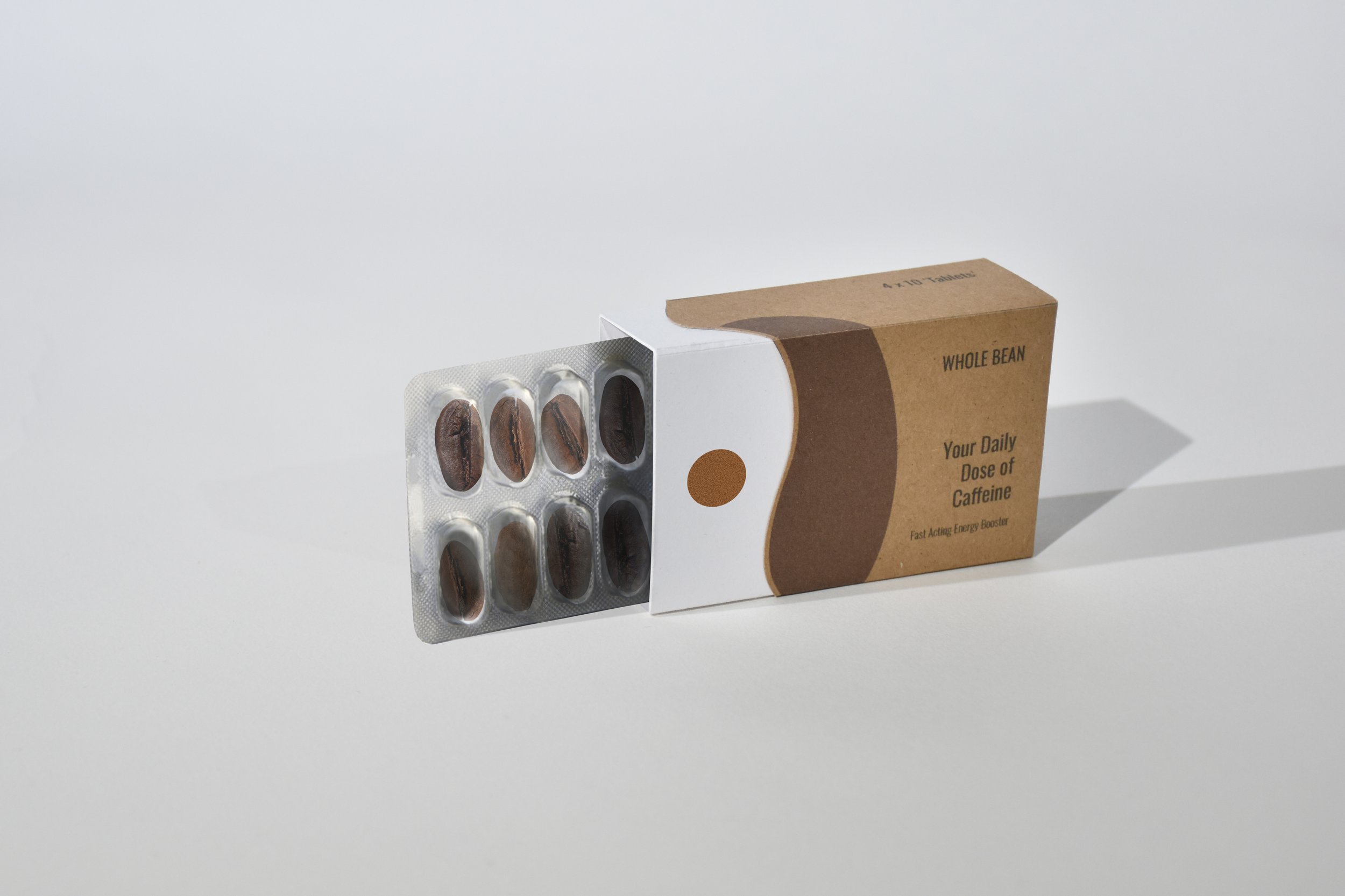
DAY&NIGHT takes on a cohesive, minimalistic and mature approach emphasising the elements of icons and colours, which implies the brand’s market targets and the seriousness of the product. The simple icon of a coffee bean and a pill complemented with their brand DAY and NIGHT also easily translates the content of each packaging directly to the users (Ambrose, 2011). Furthermore, the use of negative space in between the logos mimics the details of the object. The packaging thus employs the form of the logos and creates containers that would open following the negative space inside the logo, for instance, the vertical gap in the coffee bean logo implies the container would open horizontally. When opened, it reveals the motif of a sun, indicating the appropriate time of use. The opening and closing of the packaging also symbolise the blinking motion of tired eyes.
In regards to typography, sans serif typeface was used throughout this project to express a sense of elegance, and modernity. Its simplicity also conveys Mies Van Der Rohe’s idea of “less is more” (ArchDaily, 2021), appreciating its readability and distinctiveness.
The overall aesthetics also utilises the different shades of brown not only because it is the colour of roasted coffee beans, but theoretically it conveys the emotions of loneliness and isolation (Cherry, 2020) as if being awake in the darkness. It is also associated with a sense of strength and reliability (Cherry, 2020), and the products aim to supply users with a sense of security and resilience.
